A literal lightbulb idea ========================
Published:   2025-11-18
Last update: 2025-11-26
Table of contents:
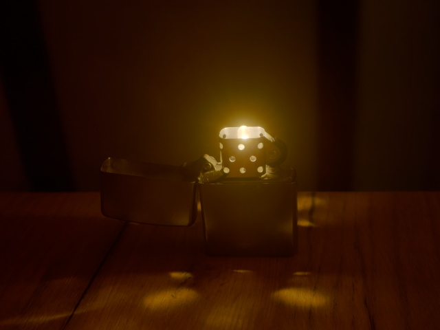
Concept art for a mod, made using HDR photo compositing.
TL;DR
I call it the "(wind)proof of concept". There is nothing original about the idea itself, just wanted to check how it would look, and how much space is available. Then I thought I should probably take a photo...
I will not say anything more about subject itself, maybe I will implement the mod in the future. The rest of the article is about how did I put together the following image of it.
Discussion
The challenge in photographing such a subject is of course dealing with the dynamic range. I wanted to preserve the details at the very nearest vicinity of the brightest area, yet keep at least as silhouettes some of the features further away, which are normally in the dark. If I optimize in camera for the brightest setting, the *dark* I have mentioned becomes pitch black, on the other hand if shoot with more sensitive settings, everything in the cage area are washed away in the brightness.
To illustrate this, in fact here is a preview of the full set I made:
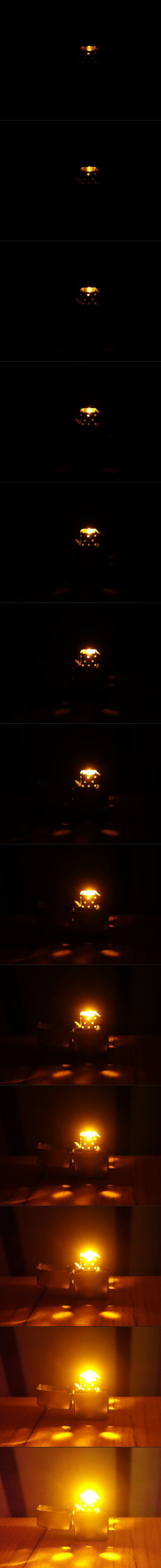
The act of taking several shots in succession like this is called bracketing. There may be support for this in certain cameras built-in, but I opted for manual in this instance to overcome some limitations. I applied exposure bracketing first, then - loosing my patience - came ISO bracketing for the brighter takes.
Details:
- Camera: Sony DSC-RX100 (v1.10)
- Mode: Manual
- White balance: "Cloudy"
- Focal length: 10.4mm (manual)
- Aperture: f/2.8
- Exposure: progressively increasing 1/8, 1/4, 1/2, 1, 2, 4 sec for the first six photos, then 8 sec for the rest
- ISO: 80 for the first seven photos, then 200, 400, 800, 1600, 3200, 6400
Combining multiple photos of different dynamic ranges into one is called high-dynamic-range or HDR imaging. Note that the term "HDR image" is often used for the rendering that results the process, but I believe technically it might only be correct to use in the context of the technique itself, or for one of the multitude of formats that actually encode the pixels in higher bit-depths, consisting of the collective information coming from the whole series of photos.
The name of actually rendering HDR data into the final (typically) 24 bits is tone mapping. It is a complex problem how to do it automated and have a great result, but anyway I wanted to have a go with this manually.
I have used the following setup in GIMP. Photos of the bracket set were loaded as layers, darkest on the bottom. Important to note that the layers had to be aligned positionally at this point - although I have used a small tripod, just pushing the buttons to change settings (especially ISO which is unfortunately buried under a menu) caused a bit of movement between shots. Then came trial and error, and I arrived at using `Screen` blending mode with a good amount of transparency applied on every layer other than the first. I have got the best result when brighter photos were set to progressively less opaque, starting from 18% on the second layer, down to 7% on the last.
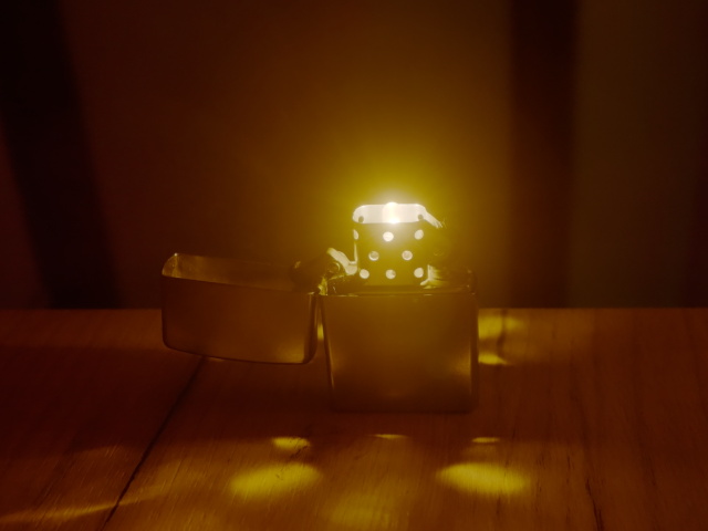
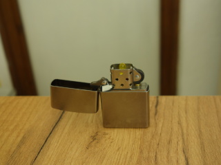
I had seen right on the camera display that the "Cloudy" balance would give me a hue with a lot more amber in it than in reality, and that caused in the scattered light the metal case to lose too much of its steel gray color. Having used compositing techniques before in 3D CGI for combining separate renders with different light sources applied, I decided to take a couple of extra shots with only some ambient lighting.
 |
 |
| Full size | Full size |
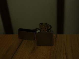
I am sorry for the lousy backdrop, I was hoping it would not show up much on the end result. You know, the whole setup took place at the end of my lab bench. I had to experiment with various lights turned on in the room, until I arrived with using only the desk lamp far on the other side of the bench, using its scattering light off of the white wall, just to avoid any harsh shadows. By the way all my lights are 4000K, which could be set in the camera too, so the colors should be pretty accurate here.
These were taken with ISO80, and 2 seconds exposure in case of the left photo, thanks to the advice of on-screen metering (with all other settings unchanged). Then I had taken two more shots that were shorter, in anticipation that maybe I will not need that much additional ambience. This turned out to be a good call as I ended up using the 1/2 sec one, which is shown on the right (but of course nobody could see what is going on if I only uploaded that one).
The ambient shot was composited onto the tone-mapped image using `Overlay` blending mode with 75% opacity. In my view it corrects several shortcomings in the "pure" first composite. I already mentioned that I wanted to steer back from that excessive amber hue (although there could be other ways to achieve this in itself). It is also unfortunate that the halo in the middle appears to wash away certain details on the lighter; this is very well compensated by the overlay. Almost as if it brought the subject more in focus, and I admit this could have been better in the first place (I should not have set the focus in the dark). Lastly I would like to point out that the overlay lightens up a couple of spots causing extra features to appear via specular highlight (especially around the right-side rivet), and darkens some places which were maybe unintuitively bright (inside the lid for example). To me it is very interesting how can these techniques make an image appear more real to the human brain, compared to something genuinely closer to reality.